Alex’s Uniform Breakdown
January 5, 2022
by Alex Zeese
Jason Wright and the Washington Football Team announced that the new name and uniforms will be made public on February 2nd and provided that one name that is out of the running, saying that wolves or red wolves will no longer be the nickname. Citing legal issues and push back from other pro sports teams who already use a “wolf” moniker, the team stated that this name is not really an option despite it being a fan favorite.
Here, I am going to go through and break down what we’ve learned about the uniform from the photos and videos out there, both the good and the bad. It’s nice to know that beyond me, there is a handful of other Washington fans who are as obsessed with this as I am, and we went through that video frame by frame to hunt down every detail, even looking at reflections in windows to try to find the new logo.
Let’s start with the logo. I’m way more interested in what the new logo is than the new name. As a visual person it’s how my brain works.
We in the obsessive uniform analysis community are 99% sure the helmet logo is a W in a military stencil font. One thing folks are debating is if there’s a Washington monument built into the logo or not; is not quite as visible. Look at the reflection in the window behind Rivera’s head here and at the photo of the front of the helmet found by Twitter user @21heylol:


It’s a W, in a classic “military stencil” style font, based on the reflection. I took a crack at tracing it on my computer, which I’ve tweeted out a few times in various discussions with other uniform aficionados.
Based on what we can see in the reflection and stuff the logo looks more like this I think. pic.twitter.com/qdnu4gQuMl
— TheHogSty (@TheHogSty) January 4, 2022
We will see how close I am in the end. I may have it backward since it’s based on a reflection, but I like my chances. What this does do is likely narrow down the new team name to something military-themed, like Admirals or Commanders.
Overall, if we are just going to have a simple W logo on the helmet, this is fine. One of the benefits of the letter W is that it can be symmetrical, so that the logo looks right on both sides of the helmet, unlike the G of Green bay and the C of Chicago’s helmet logo which looks to be backward 1/2 the time.
Other Helmet details. I generally like the matte burgundy color of the helmet and the single gold stripe. The gold stripe may also have white in the photo below, but that could just be the lighting from the window. There’s some talk of a 2nd helmet, and it being black, which I’m not sure, it could be a trick of the sunlight in the photo. I hope not – I’m not a fan of needless, stupid, black uniforms. It reaks of the ’90s.
Now let’s get into the uniform itself. I pulled these from @Scott7news, but the same photos were making the rounds on many folks’ Twitter feed:
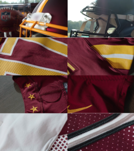
GOOD NEWS EVERYONE. They look like they are mostly be sticking with burgundy and gold as the baseline with a wider sleeve stripe, I like that; feels like it’s a classic design. We have the 3 stars from the DC flag on the inside of the jersey. One thing Nike loves to do is put stuff inside the collar for some reason. They did this exact same thing with the Titans, who I guess also play in DC?
If you notice in that one image, there is some kind of circle pattern stitched, on the back of the jersey above the nameplate. Is this a secondary logo? The jersey numbers themselves seem to be changing from white numbers with a gold outline on the jersey to gold with a white outline, which is a bit of a nod to the team’s overall look from 1933 through 1938. The away uniform seems to have burgundy numbers with a black outline. And the number font looks to have moved from a classic college block style to something a bit more modern.
The big cause for concern. In the case of Nike being Nike and having to ruin everything, there’s also a diamond/fade pattern worked into the jersey numbers. I don’t know what it is with Sweatshop Inc. and these fade patterns in numbers – it looks bad every time they try it, and yet they keep doing it. If I am correct and that design element is in the uniform they will have quickly ruined what looks to be a successful re-design.
There are serious causes for concern that Nike will screw things up here like only they would. If I’m right looking at the bottom two photos, it seems that white/road jerseys have very different design patterns on the shoulder for some reason, with some kind of diamond lattice pattern rather than the sleeve stripe used on the home jersey. I don’t know what that is or why it’s there, since we can only guess at the new name being military-themed, nothing springs to mind as to what that could be. And there’s an odd gray stripe between the numbers there as well. Call me crazy, but I wonder if that’s a monument in there. Or it’s just a shadow; we will see.
What we don’t have yet are any photos of new pants or socks.
We don’t yet know if the team plans to have gold pants as an option or just stick with burgundy and white from here on out. Nor do we have any idea what the pants will look like pattern-wise. For all the weird nonsense Nike does with trying to ruin classic-looking football teams I won’t be shocked if we have some crazy pants stripe that looks like the Washington monument.
Socks, for all the time the amoral cobblers have spent making shoes you think that their sock game historically would be strong. But looking at the other team they have re-designed, that’s something they have historically phoned in with a simple dull single color sock.